Showing posts with label OUGD103. Show all posts

Thursday, 27 May 2010

OUGD103 Evaluation

1. What skills have you developed through this module and how effectively do you think you have applied them?

During this module I feel that I have become more ambitious in terms of product development than I have been on previous projects, particularly during the collaborative and 'Speaking from experience' briefs I have tried to push myself further out of my comfort zone by testing out alternative resolutions. Also I feel that my time management has further improved as we have had to juggle several tasks at one time whilst attempting to be more adventurous with my product development which increases the workload. Finally, after the previous module I stated that I wanted to get back to some more hand drawn, illustrative work as I felt I had done a lot of computer based work and I addressed this through my illustrated vogue posters as well as the hand drawn imagery and type work on the collaborative brief.

2. What approaches to/methods of research have you developed and how have they informed your design development process?

I think that over the course of this specific module my primary research skills have developed much more through the use of qualitative, in depth questionnaires that gave direct feedback from the target audience during both the 'Communication in a virus' and 'Speaking from experience' briefs. During the 'Virus' collaborative project me and my partner collected a good volume of secondary quantitative data and statistics however this turned out not to be relevant to the idea we eventually settled on however I suppose it did help us to narrow down our target audience to something more specific.

3. What strengths can you identify in your work and how have/will you capitalise on these?

Over this module I feel that my illustration work has been a definite strength which was particularly successful on the Vogue poster project. On future briefs I would like to incorporate this more and combine it with more computer based work to give a polished, professional finish to the hand drawn work. Another strength I think has developed during the 'Speaking from experience' brief is my branding of a product range. During this project where we had to create numerous resolutions I tried to establish a clear brand to link the different outcomes together and make it appear as a professional series of products.

4. What weaknesses can you identify in your work and how will you address these more fully?

In terms of weaknesses, although I said my time management has improved, I think that there is still room for more improvement but also I tend not to record how I manage my tasks as I usually just do it mentally. I think by making more of a concerted effort to document my time management it would help me to look at how I use my time and also help me to plan more effectively which I would hope to make me more productive. I also think there is a bit of a weakness in my blogging which links from the time management issue as quite often I build up a back log of work which I then tend to blog all at once instead of blogging consistently on a daily basis. This can cause problems when it comes to analysing and commenting on the posts as its sometimes difficult to remember back to the project.

5. Identify five things that you will do differently next time and what do you expect to gain from doing this?

- Blog more often and consistently to help me analyse my work.
- Develop my technical skills further on Adobe Illustrator and InDesign to add more dimensions to my work.
- Continue to push my illustrative work as this could help me to create a stronger identity as a designer.
- Make the most of the resources on offer such as screen printing and letterpress as it will help to show my diversity as a designer.
- Conduct larger volumes of research and be more selective in terms of the information I gather to help direct my projects better.

6.

Attendance: 5

Punctuation: 5

Motivation: 4

Commitment: 4

Quantity of work: 4

Quality of work: 4

Contribution to the group: 4

Tuesday, 25 May 2010

Brief: Speaking From Experience - Evaluation

What problem did you identify?

I chose to address the problem of informing new students to the BA Graphic Design course at Leeds College of Art about appropriate design related places that could benefit them during their studying in the city of Leeds. When first moving to a new city and place of study it is easy to settle on using solely the facilities closest to hand but I wanted to encourage students to make the most of creative sources across Leeds through my product range.


What evidence did you find to support your decision?

Across the duration of the first year I had often noted fellow students wanting to know where to find particular resources to aid them in their work. Even though there are many city guides about Leeds listing what the area has to offer, there was never anything specifically design related and so I chose to address this initially by developing a 'Designer's Index' which would form the basis for further product development.


What methods did you use to gather your evidence and what forms did it take?

As the brief title was 'Speaking From Experience' I started by drawing on my own knowledge and experience from the past year thinking back to places I have found beneficial. I also informally asked other students in the class for resources outside of College that they thought useful as well as consulting different existing city guides, maps and listings.

What methods of research did you find useful and why?

I found all methods of research used during the project to be both successful and useful. Speaking to fellow students and drawing on my own experiences of the first year was always going to be most appropriate as we, at the start of the year are what has now formed the target audience for this brief. Then by looking at existing informative guides and catalogues I was able to gain an understanding of how to layout the information I was gathering in a clear and concise manner that would create the easy use, quick reference index that I wanted.


How did these inform your response to your problem?

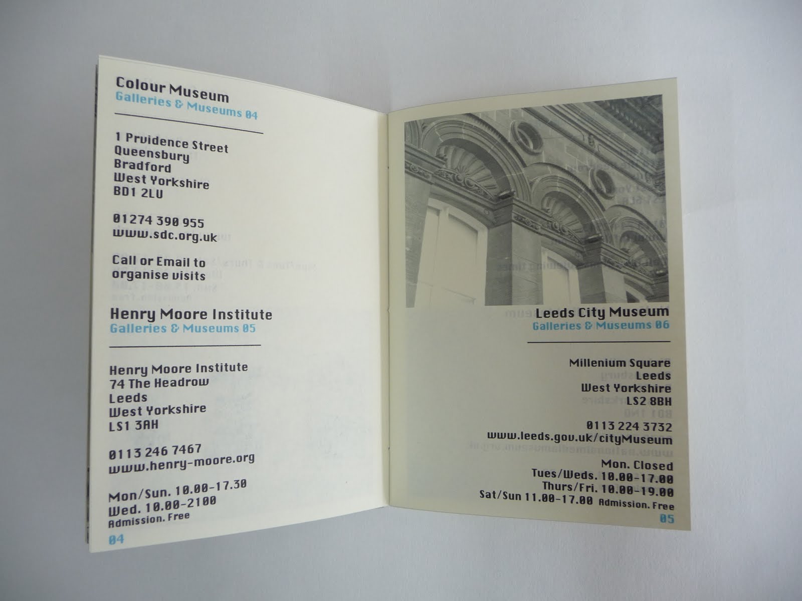
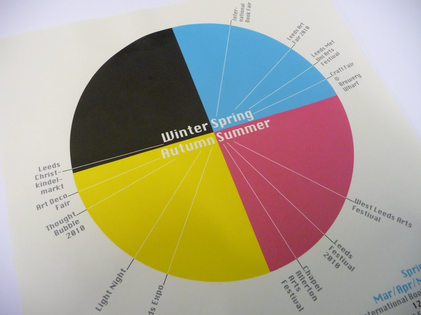
By looking at the research I had accumulated I was able to be selective of the information that was included in the products that I was developing. For example, in terms of the booklet I narrowed down the wide ranging list of suggested places into three categories each of which had 12 resources listed within them, 36 in total with the three categories being - Galleries and Museums, Materials and Resources, Places of Interest. To keep the consistency going, when developing the calendar I also included 12 events and overall I felt that this was just the right amount of information to include.


What research could you have carried out that would have proved more useful?

I think the research I could have undertaken that would have proved more useful would have been on the subjects of distribution and product development. I would have liked to look into different ways that my products could be received by my target audience and also to have investigated a slightly more adventurous range of products although I am pleased with what I have produced as I believe they are very useable and useful things to have upon starting the course.


List five things you have learnt about the design process over the last five weeks:

- Learnt more about building a brand and maintaining consistency across a product range.
- Keep target audience in mind at all times.
- Have clear concepts and messages ready for crits in order to get valuable feedback.
- A range of products do not have to look the same.
- Learnt to be selective of information to communicate.


List five things that you would do differently next time:

- More research into product distribution.
- Investigate into a more adventurous product range.
- Put together a proper research questionnaire instead of asking people informally.
- Start designing the digital side of the product range earlier.
- Design some supporting illustration work for the brand.

Thursday, 22 April 2010

Brief: Speaking From Experience

Rationale 1

Brief: (What is the problem you intend to solve?)

'Everything you need to become a Graphic Designer in Leeds'


Who needs to know?

First year students on the BA Graphic Design course at Leeds College of Art.


What do they need to know?

I feel that they need to know what and where design related places are located in the city. For example; where to source materials, places to get inspiration such as galleries and museums and where to find books, magazines and journals.


Why do they need to know?

So that they know where to source materials, books, magazines and journals. Also so that they know where to find relevant galleries, exhibitions, museums and events.


What will they respond to?

I think they will respond to a physical product, perhaps a printed booklet of some kind, that they could receive at the beginning of the course as I remember appreciating welcome packs for example when I first started.


What research is required?

Primary: Going out into Leeds and sourcing all relevant locations to inform the target audience of, photographing and documenting them. Asking classmates for their tips on places to source materials, books and magazines also where the best and most appropriate galleries and museums are.
Secondary: Internet research to find out a comprehensive list of what design related places are located in Leeds. Collect existing guides and maps.


Rationale 2

Brief: (What is the problem you intend to solve?)

'To prevent new students and visitors from getting lost around college'


Who needs to know?

First year students on the BA Graphic Design course and visitors to Leeds College of Art.

What do they need to know?

They need a new, clearer set of directional signage to replace the current system that is used.

Why do they need to know?

To help people that are new to the college navigate their way around whilst they get to know their new surroundings.

What will they respond to?

They will respond to something modern and contemporary that remains in keeping with the 'identity' of the college but something that most importantly is visually clear and

What research is required?

Primary: Documenting and photographing the current directional signage used around the collage. Also look into what signage is used in museums, galleries and other public places around Leeds.
Secondary: Look at relevant books on information graphics and signage/mapping.

Tuesday, 30 March 2010

Brief: Communication is a virus- How does it spread?


Comments that were recieved on the final piece for 'Communication is a Virus'...

"The final design looks really professional and well crafted. Nice idea, but could have used harder phrases."
"Looks really good and like how the cards fit inside the packaging along with more information!! =) Really like the colours too!"
"Good interaction with mailshot."
"I think its a simple idea that works really well. Easy to carry around, fun and lots of information... Will people read all the text, is there a way of breaking it up?"
"Lovely colour choices and I really like the way the booklet folds out, nicely sized too."
"Good resolution. nice use of colour. Well crafted."
"Good colours and interactive final."
"Yeah I like it, the idea of the individual cards is appealing."
"Really nice idea, nice final product."
"Nice packaging, clearly alot of thought has gone into this."
"I like this alot. Such a great idea and done with class and simplicity. maybe font inside needs to be a bit bigger. the cards are very effective, they contain the right interpretation and don't loose impact. Nice design aswell."
"Wow to the packaging! =)"
"When you guys first told me about your idea I thought it would be difficult to pull off effectively although you've done a great job. Works as a nice unified package. Check the Polish words spellings though!"
"Really exciting and innovative packaging."
"Nice use of watercolour in development, well crafted package, not sure on the font for the front cover. Think of other nationalities that struggle to interpret basic text. Other than that, great work."
"Well thought out idea, nice packaging and use of colour. Easy to read and understand."
"Cool stuff!"

Brief: Communication is a virus- How does it spread?

Chosen partner: Hazel Gage

Why have you chosen to work with your creative partner? What are your aims?

Me: I have chosen to collaborate with Hazel because I feel we have differing creative strengths, but we also think in a similar way and are both very committed towards our work. I think having this similar attitude will help us absorb new skills from each other over the course of the brief.

Hazel: We have similar ways of approaching work and we are both very dedicated. Jonny has an illustrative side to his work which I would really like to use in some projects.


What are your specific areas of creative interest in this brief?

Me: My specific areas of creative interest lie within hand drawn illustration and type, or producing any original artwork which can then be scanned in and digitally manipulated. Other interests are digital typography and photography.

Hazel: I like illustration but am not fond of my own drawings. I think my area of expertise would be more on the computer based side of things - digitalising artwork and possibly creating a website.


What design skills do you have to offer in relation to your chosen brief? How do you intend to use them?

Me: Hand drawn illustration and type, digital type and layout, Photoshop.

Hazel: Layout, Type, Photoshop, Illustrator, InDesign.


What specific non-design skills do you have to offer in relation to your chosen brief? How do you intend to use them?

Me: Idea generation and development, research.

Hazel: Research, blogging and documentation, evaluation.


What will your specific roles be in the collaboration in relation to your brief?

Me: Illustration/hand drawn imagery, Photoshop.

Hazel: Digitalising artwork, Illustrator, Photoshop, InDesign.


What will your individual responsibilities be in relation to the brief?

Me: Producing original artwork, researching, idea generation, aiding production of finished pieces, good communication, compromising with my partner.

Hazel: Researching paper manipulation for the mail shot, sourcing locations to place the finished product, digitalising artwork.


Joint responsibilities?

Developing product, idea generation, researching, questionnaire, testing different practices and techniques.

Brief: Communication is a virus- How does it spread?

Presentation
How professional was the verbal element of the presentation? Was it delivered with clarity? What might have improved it?
1. Well presented, a few points were unclear but the initial point well chosen.
2. Well prepared. Notes organised. a bit of confusion with the target audience being holiday makers.

How professional was the visual element of the presentation?ow well were the boards designed? What might have improved them?
1. Boards were clear, mixture of image and facts. Well balanced, clear representation of research.
2. Too much on the boards. Presentation boards could have been done on the computer to ensure clarity.

Proposal
What is the message?
1. Learn a new language.
2. To get people who travel to foreign countries to learn the language of the country they are travelling to.

Is there a clear sense of audience? Who is the project targeting?
1. Yes, people going abroad, to learn more about the language.
2. 35-55, more cultured travellers.

What context will the message exist in? How does the proposed solution answer the 'virus' element of this brief?
1. It answers the brief well, trying something new, learning a new language, I think creatively exploring this will do this effectively with input.
2. Flyers and mail shots. Targeting appropriate places where the message can spread.

Overall, what do you think of the proposal?
1. Very interesting, I think the fun aspect should be kept, really like the idea of the figures.
2. Good idea, could be made fun to make it more appealing.

Tuesday, 9 March 2010

Brief: Communication is a virus- How does it spread?

Brief:

A graphic response to the issue of 'Getting people to talk more/communicate more'.

Considerations:

Nationalities, languages, bringing people together, integrating people into communities, body language, greetings.

Target Audience:

Integrating nationalities, and people from different backgrounds.

Tone of Voice:

Friendly, curious, welcoming, persuasive, interesting, comfortable, personal.

Background:

Data, population and nationality statistics, interaction, communication, questionnaires, emails, language centres, council information, organised existing events.

Mandatory Requirements:

Two colours plus stock, easy to reproduce, visible to a large audience.

Deliverables:

3 x A2 presentation boards for the pitch on the concept, content and method of delivery.

Visual Language: What Is Line?

The Brief:

Produce a body of work based around the statement, 'A formation of people, objects or things, on, beside or behind each other'.

Considerations:

Tree trunks, branches, roots, bark and texture, tree rings, growth, decay.

Target Audience:

People interested in nature and trees. 30-50. Purpose? - to direct, inform.

Tone of Voice:

Playful, curious, interesting and lighthearted.

Background:

Nature guides, maps, walking routes, photography, maybe hand drawn illustration, different types of mark marking.

Mandatory Requirements:

Body of work including imagery, research, photographs, sketchbook work, documentation.

Deliverables:

Body of work and a final piece (book?)

Monday, 1 March 2010

Brief: InDesign Workshop

The Brief:

Using a subject matter of a fellow classmate (Sophie Herring) you are required to produce a visually considered double page spread based upon them using information gained from the interview and their blogs.

Considerations:

Explore type,layout,image and colour. How does each component react with each other.

Target Audience:

Our given classmate - Sophie Herring, and the rest of our group.

Tone of Voice:

Lighthearted, playful.

Background:

Base on interview responses and blog work, 'Hand Job' book, 'This is England' film, Eduardo Recife, Collage work, Pen work and fine liner,Photography - Fish Eye, 1980's era, This is England film, fashion of the time, handmade and handcrafted, baking, cakes, Sox- silver tabby cat,South Shields, by the sea, beaches, Carbis Bay, 8/10 cats, Sean Lock, Stand up videos.

Mandatory Requirements:

A3 Stock (237x380) 2cm bleed, Landscape.

Deliverables:

One double page spread.

Brief: Don't Panic - VOGUE

Design One

Design Two

Design Three

What statement/fact/question/concept/tone is being communicated?

-Question: What is Vogue?
-'What is Vogue' - coming away from stereotypical women's fashion. What is popular/fashionable?
-'What is Vogue' - Ties, different styles, making up the question itself.
-'What is Vogue'
-Posing a question that has many answers.


Is this being communicated effectively?

-Yes, clear visuals.
-Yes I like the collection of ties and the patterns. However the word 'Vogue' could be misread,
-Yes lots of different styles of ties, so message is saying, Who knows what fashion or style will be next?
-Yes through type and a variety of styles of ties.
-Yes use of ties in text.


Have the posters answered the brief?

-Yes, your interpretation of what Vogue means to you.
-It seems to reflect the 5 chosen words well.
-Yes asking the question, What is Vogue? Makes people think and wonder that its more than a magazine.
-Yes it clearly focusses on the word Vogue.
-Yes, coming away from 'traditional' Vogue. Material - literal meaning.


Who is the audience - have they been addressed?

-Students, particularly directed at males.
-Students, more for men as it uses ties.
-Directed more towards males.
-Students, males because of the tie theme.
-Students, ones that question the norm.


Strengths:

-Varied colours and patterns, they work well together.
-Simple/Subtle/Effective.
-Quite like the subtle, muted colours used and how the words have been spelt.
-Variety of tie designs and possibility of further development.
-Well drawn and painted.


What could be developed further?

-Maybe try a background colour or print on coloured stock, maybe a border?
-Tweak the word Vogue slightly to make it more legible.
-Patterns with the ties & different layouts.
-Try changing white background, maybe have outline to the poster.
-Collar or shirt designs? Bring out saturation of the colours of the ties.


Further feedback:

-The clear and effective visuals communicate well to the target audience.
-Good idea, I particularly like the portrait layout.
-Look at background colours.

Tuesday, 23 February 2010

Brief: Don't Panic - VOGUE

The Brief:

To design an A2 poster for the Don't Panic company based around the word 'VOGUE'.

Considerations:

Poster art, Vogue magazine, previous artwork used in Don't Panic products.

Target Audience:

University students, young adults, 16-24 age group.

Tone of Voice:

Youthful, casual approach in tune with university students/ people of my own age group.

Background:

Based around the word 'VOGUE'.

Mandatory Requirements:

File type - JPEG or PNG, Resolution - 72dpi, File size - 2MB. Final design if chosen should be at a resolution of 300dpi.

Deliverables: A2 Poster at a resolution of 300dpi.